Article
Why typing headings in all-caps is a manuscript no-no
On the surface, typing something in all-caps doesn’t seem like a big deal. But there are a few significant reasons why this should always be avoided in a manuscript.
There are many reasons why someone may type in all-caps. The author may want their part headings or chapter headings to stand out; editors and copyeditors may be trying to match the manuscript to the designer’s template. So, why is it a problem? It is not possible for the typesetter or layout artist to automatically display lowercase text when required.
Making text appear in uppercase can be done automatically with stylesheets, but there is no automatic setting for making all-caps appear in lowercase.
InDesign provides functionality for the typesetter to manually select text and convert to lowercase, sentence case or initial caps – but this conversion cannot be assigned to a stylesheet. When the manuscript is presented for layout with all-caps headings, the typesetter has to selectively convert them, paying attention to proper nouns, initialisms and acronyms.
This is necessary because parts of the document, such as headings, are referenced in other parts of the document, such as contents, where it is rarely desirable for the text to appear in all-caps. The simple solution is to ensure all headings are lowercase with capitalisation where appropriate and, in those places where the designer has stylised something as all-caps, InDesign stylesheets take care of this automatically.
For editors and copyeditors, it can be tempting to type headings in uppercase if the designer’s template has styled them this way, but this is a mistake – and unnecessary. Regardless of the designer’s styling, no headings should ever appear in all-caps. The same principle applies to the first few words of the chapter. Even if the designer has specified all-caps or small caps, the text should appear in the manuscript as initial cap and lowercase. Consider that those words may be referenced in an endnote snippet or index entry, and they will not appear in that context in all-caps or small caps. Similarly, no AllCaps/SmallCaps attributes should be applied. InDesign will apply the designer’s stylisation automatically.
It can be difficult to disassociate the appearance of the manuscript with the appearance of the text in its typeset form, but this approach is encouraged. Each digital manuscript should be as generic in form as the next.
Being conscious of things like this has become much more important in the age of ebooks. There is far less control over the styling of text in an ebook compared to layout programs like InDesign and QuarkXPress. Ebook readers may impose their own formatting on the text and this will frequently clash with all-caps text. If you’ve ever seen an ebook where the first three words of the chapter is a lovely small caps and the fourth word is normal-sized caps, that is an example where the manuscript has tried to mimic the designer’s layout by typing words in all-caps.
There is important distinction between styling something as uppercase and converting something to lowercase. When InDesign automatically styles text as uppercase, the underlying characters remain unchanged. On the other hand, when converting from all-caps to lowercase, the characters are being replaced with their lowercase counterpart. Any experienced typesetter will feel uncomfortable changing text content unless instructed. Those kinds of changes should always be done with editorial oversight.
The copyediting stage is the ideal opportunity to make the required amendments. Copyeditors are experienced with the nuances of proper noun capitalisation, initialisms and acronyms – more so than the typesetter or layout artist.
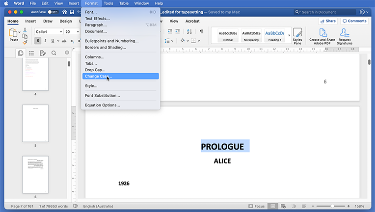
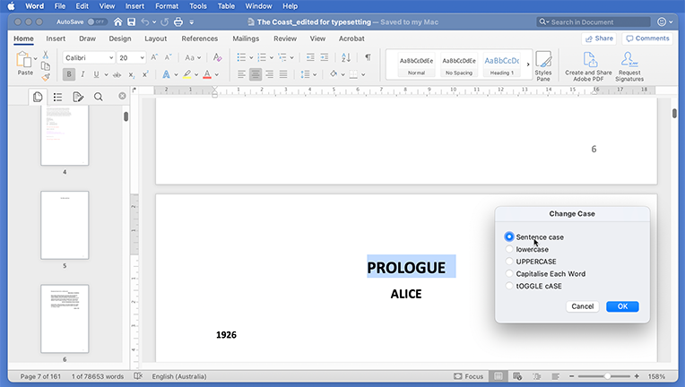
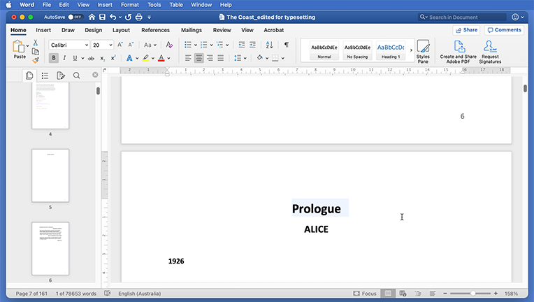
For publishers, it is recommended to include an instruction in your copyeditor’s brief: convert all uppercase headings to lowercase, with capitalisation as required. The copyeditor does not have to re-type the text – Microsoft Word provides a conversion function, as shown below, accessible via the 'Format' menu.
This gallery shows the process, and options, for converting text from all-caps to lowercase/caps. (Swipe or click left/right.)
The transition to onscreen editing is relatively new in the broader timeframe of digital typesetting. There is some cross-over of the toolset between word processors like Microsoft Word and typesetting systems like InDesign, and this understandably leads to some confusion about what formatting is required in the onscreen manuscript. The simplest way to think about it is: the less formatting, the better. From a high-level perspective, the only concern for a digital manuscript, beyond the words themselves, is that it captures the heading levels, block elements (quotes, boxes, etc.) and character attributes such as italics.
When working on the digital manuscript, forget about the design template – if heading levels are correct and there’s no all-caps in sight, the powerful features of InDesign will take care of the rest.


