Article
The ubiquitous point-size value is not telling us everything about readability
Logically, 12-pt type in one font should look the same size as 12-pt type in some other font, right? It turns out that font sizes are a bit like clothing sizes: size 12 in one style is not the same as size 12 in another.
Let’s take a look at this phenomenon at work before diving into the reasons behind it. The following fonts are all 12 points:
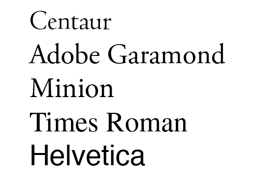
Check out that Helvetica! It’s hard to believe it’s the same size.
The reason for this is simply the way font size is measured – point size refers to the distance from the top of character ascenders to the bottom of descenders.
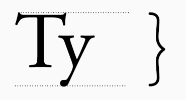
The way we perceive font size, however, is more closely related to the size of the lowercase characters, called ‘x-height’. Here are the same fonts as shown above, on one line. The dotted lines trace the x-height.

Many sans serif fonts have a much larger x-height relative to their ascenders and descenders. The overall size from top-to-bottom may be the same as a serif font, but the x-height takes up a much larger proportion of that space. Serif fonts, on the other hand, typically have somewhat similar proportions for ascender, descender and x-height.
When we create a design with a mixture of fonts here at Bookhouse, we are looking more closely at the x-height of the characters, rather than point size.
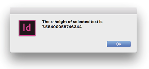
Using point size to specify font size is deeply entrenched in the systems and language of typography. In fact, InDesign does not even show x-height values in the user interface. We have written a handy little plug-in to overcome that shortcoming:
Why does this matter?
Some authors may be interested in the size of their body copy text as a means of comparison with other books or based on their own experience with a word processor. A font’s x-height is a better method for determining readability. If your author is enquiring about font size, we can provide you with the x-height of their body copy, along with the x-height of other well-known typefaces such as Times Roman.
If the demographic for a book has legibility as a concern, then utilising fonts with taller x-height is an advantage. As a rule of thumb, body copy set at 12-point should target x-height of 5 points or larger. Times Roman, for example, is 5.37 pt. Minion is 5.24 pts. Centaur, on the other hand, which has diminutive lowercase characters, is 4.4 points. By way of comparison, Helvetica’s x-height for 12-pt type is 6.275 points – significantly larger. If you’re targeting readability, fonts with an x-height above 5 points work best.
Another way of making comparisons is to calculate the x-height as a percentage of the point size. For instance, Times Roman x-height is 45% of point size (rounding off to whole numbers). Minion’s x-height is 44%. Centaur’s is 37%.
For the designer, x-height is a very useful tool in determining the right point size for complimentary sans serif fonts in elements such as boxes and captions. This is something to which we pay close attention here at Bookhouse. For example, if we were to integrate Helvetica into a design, for an element such as email text, with a body copy using 12-point Minion, then we would target a point size for Helvetica which gave an x-height close to 5.25 points. In this case, we would set the Helvetica email text at 10-pt which gives us an x-height of 5.23 pts – very close to Minion’s 5.24 pts.