Article
Settings for creating title page PDFs
Matching the title page to the cover design is a lovely experience for the reader, bringing the beauty of the cover onto the text pages. For the cover designer who makes this happen, there are a couple of little tricks to getting this right.
Because the typesetter must integrate the PDF into their final art for the printer, using the right PDF settings ensures the book will pass the printer’s preflight. Here are the settings to use:
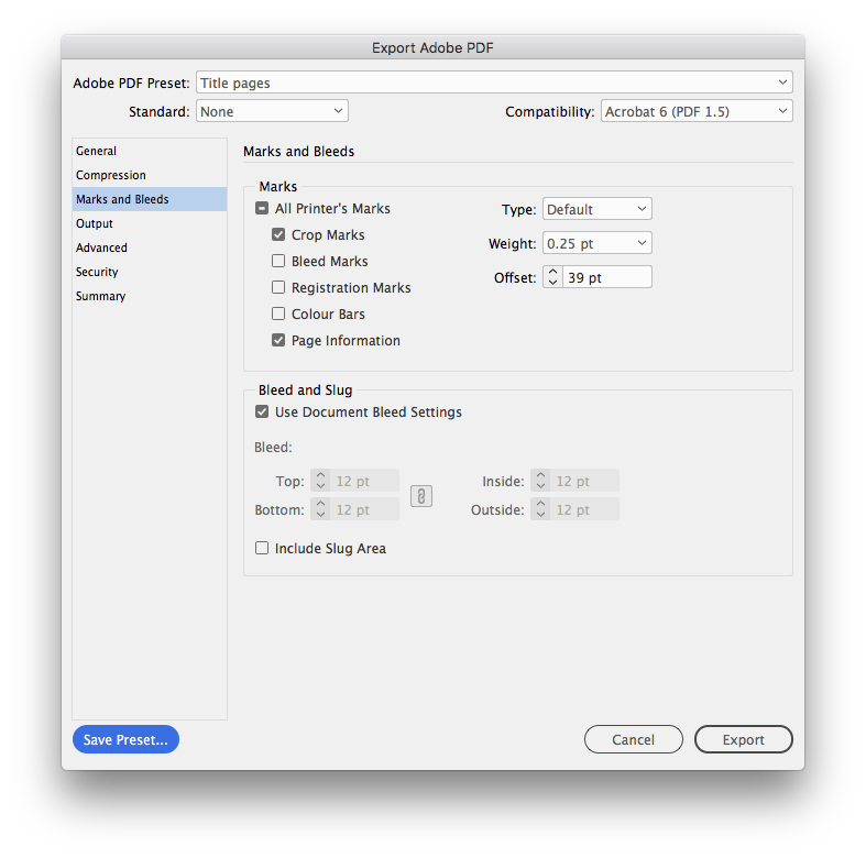
Less is more. Just crop marks at 39 pt offset is all that’s required.
Note:
- do not include bleed marks
- do not include registration marks
- do not include colour bars
- page information is optional
- crop marks at 39 pt offset
If your design includes elements that bleed off the page, make sure the document bleed settings are at least 4 mm (12 pt) and click the option for ‘Use document bleed settings’. Alternatively, un-tick this option and enter the bleed settings directly. Do not include the Slug Area.
Other useful tidbits
Use vector
Title pages are best done in InDesign but if Photoshop is absolutely necessary, be sure not to inadvertently rasterise the text.
No need to include the publisher’s logo
It is better for the typesetter to place the logo because they can align it with the last baseline of the text block. They will also ensure that the logo size is consistent across multiple books.
Not too low on the page
Don't let the vertical balance to get too low on the page. One useful technique when centering vertically on the page is to exclude 45 mm from the bottom of the page and 25 mm from the top of the page, and then center vertically within that space.
Not too large
Because the binding excludes some space from the spine of the book and the logo excludes some space from the bottom of the page, the overall design is likely to be smaller than the cover. Keep the width to a maximum of about 110 mm.