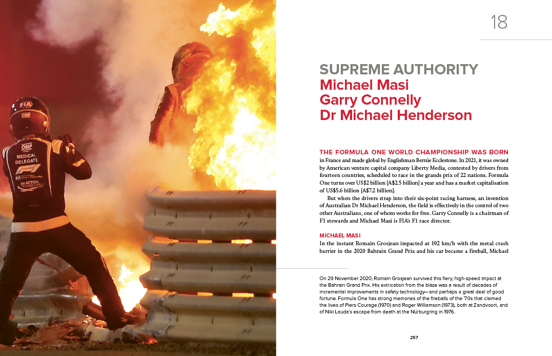

Technique
The marriage of images and text
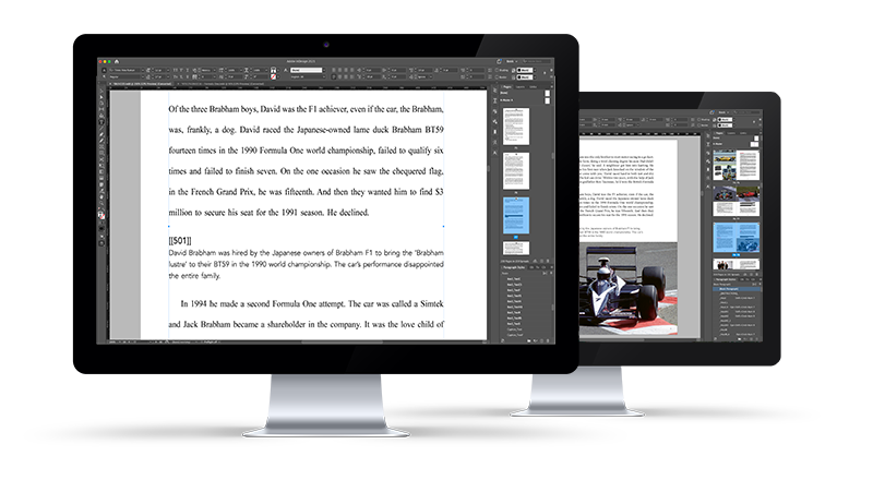
It can be a challenge to combine images from multiple sources and efficiently key their location in text. We’ve developed a super-simple technique which works for any project, from basic to complex.
Bookhouse specialises in providing book design, typesetting and layout services for Australia’s leading publishers.
At Bookhouse, we love making books. It’s our thing. We care about all the words and their diacritical accessories. We care about how they look and where they go. We fuss over the spaces they wear, the types they hang out with, their picturesque views and colourful homes. We relish the details and revel in the challenges.
We understand the challenges of modern publishing—we have the skills and tools to handle them. At Bookhouse, we make sure all the things within the invisible margins arrive on time, in style and within budget.
Typesetting is a fundamental component of a beautiful book. The best typography is invisible to the reader.
At Bookhouse, we customise the typography of the body copy to suit the typeface. From extensive experience with practically every body copy font, we have figured out how to space the words and letters to achieve beautiful, consistent spacing.
Our advanced typography settings allow us to almost completely eliminate hyphenation. When a word break is required, we use Collins Gem, or your custom dictionary. We also take great care to make sure the typesetting meets the target page extent.
Integrating cover design and text typography is the core of beautiful book design.
At Bookhouse, we customise the typography of the body copy to suit the typeface. From extensive experience with practically every body copy font, we have figured out how to space the words and letters to achieve beautiful, consistent spacing.
At Bookhouse, we make text designs that are meticulously matched to the cover. Text heading style is carefully derived from the cover fonts. The body copy typeface is chosen based on the desired feel and target demographic.
Effective book layout combines artistic expression, technical skill and efficiency.
Our strength lies in the ability to take the designer’s template and apply it to hundreds of pages while maintaining, and expressing, the artistry of the design.
We also know that time is a precious thing in a deadline-driven industry. Effective layout requires an efficient workflow and that’s a core part of our services.
Our manuscript preparation service ensures the text is clean and provides the tools to work efficiently.
Our strength lies in the ability to take the designer’s template and apply it efficiently to hundreds of pages while expressing the artistry of the design.
Onscreen editing can be fruitful or frustrating. We all know that ubiquitous word processor can get in the way. Our manuscript preparation services removes all the irrelevant muck and provides cleanly-styled text ready for editing.
Modern book publishing is demanding. Fast turnaround requires a focus on efficiency.
Bookhouse’s layout toolset includes more than forty in-house automation plug-ins. These ‘supermacros’ streamline repetitive tasks and ensure consistency across hundreds of pages. We use them to improve the quality of our work as well as improve efficiency.
Our plug-ins are completely native to InDesign, using Adobe’s scripting language to automate a repetitive series of normal InDesign functions. The toolset is robust, from finding stacking and short lines to fixing images for press.
It’s the driving force in an efficient system, and a core component of our services. At Bookhouse, we have a clearly-defined and practical system for managing all stages of production, from manuscript preparation through to bulletproof softproofs of final art.
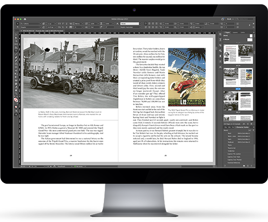
Formula One by John Smailes. Published by Allen & Unwin.
Formula One provided us the opportunity to utilise our creative, technical and workflow resources in an amazing collaboration with senior editor, Samantha Kent, and designer, Philip Campbell.
One of the unique challenges was the integration of high-quality black-and-white images alongside modern photography. This was not one of those designs where mono images were an occasional style choice.
To ensure the black-and-whites had the same impact as their coloured counterparts, we developed a special technique to enrich the shadows and enhance the contrast. Instead of the usual technique of laying small amounts of cyan in the shadows—risking an unwanted colour cast—we carefully mixed cyan, magenta and yellow at a specific ratio to produce a clean, neutral grey which we blended into the shadows using a precise curve. The final result was richer blacks without the expense of additional plates.
With more than a thousand image files from multiple sources, meticulous image management was paramount. To make this easier for the publisher, we provided ongoing reports of which images were used in each chapter and from which libraries they originated.
To meet the demanding production schedule, the layout and corrections were done in parallel batches. As the layout progressed, we kept the publisher informed about the projected page extent and looked for opportunities to include impactful full-spread images.
Our passion for book design runs deep. We have a clear focus on meeting the brief and we customise every aspect of the typography to suit the content.
We know book production involves organising multiple suppliers and we stick to the schedule. We can even save you some time if someone else has fallen behind.
After typesetting more than a million pages, we know some stuff about font technology, image processing, onscreen editing and workflow.
Making books is not just a day job. Bookhouse staff are all passionate about books. They enjoy creative expression and working with cool technology.
Some of what we do can only be seen on the bottom line. We understand the financial constraints of book publishing and our workflow is designed to save you money.
We’re happy to handle special requests, answer questions and share the insights of our experience. To us, that stuff is collaboration, not billable hours.
It can be a challenge to combine images from multiple sources and efficiently key their location in text. We’ve developed a super-simple technique which works for any project, from basic to complex.

Bookhouse’s page proof PDFs have a versatile feature which enables non-printing elements such as page border, crop marks, baseline rules and watermarks to be turned on or off. This makes it possible to customise the PDF for special circumstances, such as providing a clutter-free PDF to reviewers.
The once well-known widow and her unrelated orphans have an unfortunate case of mistaken – and stolen – identity.
Font size is universally specified as ‘point size’. But this number is surprisingly unreliable as a metric for readability.
A resolution of 300 DPI is the standard reference for images. But there are many instances where much lower resolution is perfectly adequate.